Tuesday, March 6, 2018

Final Project


Answer the following questions to get familiar with the graphs:

1. Click on the first caption, what is the graph about? Now, click on the second caption, what is new in this graph?

2. Observe the first graph, do you notice any decrease in fatalities after the last legislation that was passed in 2005 (check graph 2)? If not, what do you notice?

3. Do you think any previous legislations have helped prevent mass shootings in the US? Please observe the number of fatalities to answer this question.

4. What do you think will help prevent any future mass shootings?

If having trouble interacting with the visual, please click https://public.tableau.com/views/USMassShootings1/Story1?:embed=y&:display_count=yes

Monday, February 12, 2018

Visualization 3


Description of Visual:


Our main question for our visualization is “Which Area is Attracting the most Theft?” For our data set, we analyzed January 2002 to December 2011. We started the project by doing some data cleaning first and decided to not look at recent data due to the recent years did not include location of where the crime of theft was committed. To answer our main question, we decided to use a map of Chicago and a bar chart to highlight which districts have the most number of theft during those particular years. We decided to visualize on a map to see the magnitude of crimes on a color scale. The range of colors highlights the number of thefts in that district which the districts are represented in circles. The color scheme goes from yellow (least amount of theft) to brown (greatest amount of theft). By using the same color coding, we created a bar graph of total crimes for each year. This allows the user to efficiently see which district has the most theft. On the bar graph we noted that we excluded districts 13, 21, 23 and 31 due to these districts not having enough significant data.  We provided a drop down menu for both visuals to let the user compare different years or look at all ten years as a whole. We hope our choice of visualization will help the user understand the main question that we are answering with the given data set of theft in Chicago. 

Here are a few questions to get familiar with the visual:

1. From the bar graph, is there a noticeable increase or decrease in theft over the years?

2. Choose two years, look at which district has the least amount of theft and the most. Are these districts the same for both years?

3. Look at the map visual. By looking at it are you able to tell which area has the most amount of theft?

4. Using the bar graph, select all years. Which three districts had the highest theft rates?

Tuesday, January 30, 2018

Visualization 2:


Answer the following questions to get familiar with the graphs:

1. Which age group had the highest population for 1900 and for 2000?

2. What is the population for the 40 year old age group from 1900 vs. 2000?

3. From the year 2000 data, between the age groups 35-90, which gender has the highest population?

3. What type of trend do you notice about both gender population in the year 1900?

Saturday, January 20, 2018

U.S. Homeownership


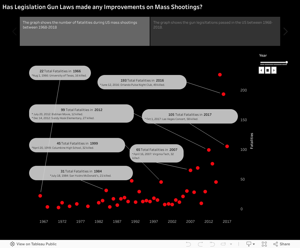
Lets explore the graphs above with the following questions:

1. From the top graph above,  hover over the line graph to see the difference in percentage from of homeownership from 1940 to 1960. Does it show there was an increase of homeowership? Can you find the time period where there was a drop in homeownership?

2. What are the top 10 occupations for the years 1940 and 1960? To view different years, at the top of the visualization under "Choose a year," there is a slide bar where you can drag the circle at the right of the bar and click and drag to the left for the respective year (you can also click on the left or right arrow button to the right of the bar slider). Hover over the graphics below the bar to see what the occupations are. Does 1940 and 1960 have similar top 10 occupations?

3. From the bottom graph, choose four different occupations in engineering. Does all four occupations follow an uphill trend? Between the four, which has a higher percentage in home ownership?

4. From the visual, go back to the top 10 occupations for 2012. Choose 4 occupations from the top ten. Then use the four drop down menus to compare them on a graph. From the 4, which had the highest homeowner percentage?


Evaluation:
The author created a visual that was user friendly. In her visual, she broke it down into two components. The top part of the visual she showed the top 10 occupations of every two years starting from 1900 to 2012. She used colorful symbols to represent the occupations. The use of interactive data for end users such filters and visuals help users be engaged with the data. The author also included a line graph side by side next to a picture of a house filled with color up to the percentage of that respective year. The line graph shares the effect of the rise in home ownership for most occupations during the coming years. The use of color filling up the house makes it an easy way to understand the data she was trying to convey.

The bottom part of the visual compares four different occupations from four drop down menus and comparing it all onto one single line graph with bright color coded lines. The author also added grey lines to the same graph (which can be omitted) to also be compared with all the other occupations of the timeline. However, the author provides an overwhelming list of occupations to choose from. It may cause the user to be overwhelmed. It was clear to notice that the data was on an up climbing thread.

The visualization was able to connect to the end user's learning by displaying on the graph a steady increase boom of ownership between 1940 and 1960. It also shows a slight decline in 2010. These observations can show the end user about the economy during those times, whether it be a rise in the economy where people were able to get more jobs and afford a mortgage, or when the economy and job market was on a decline and people could not afford to own a house.